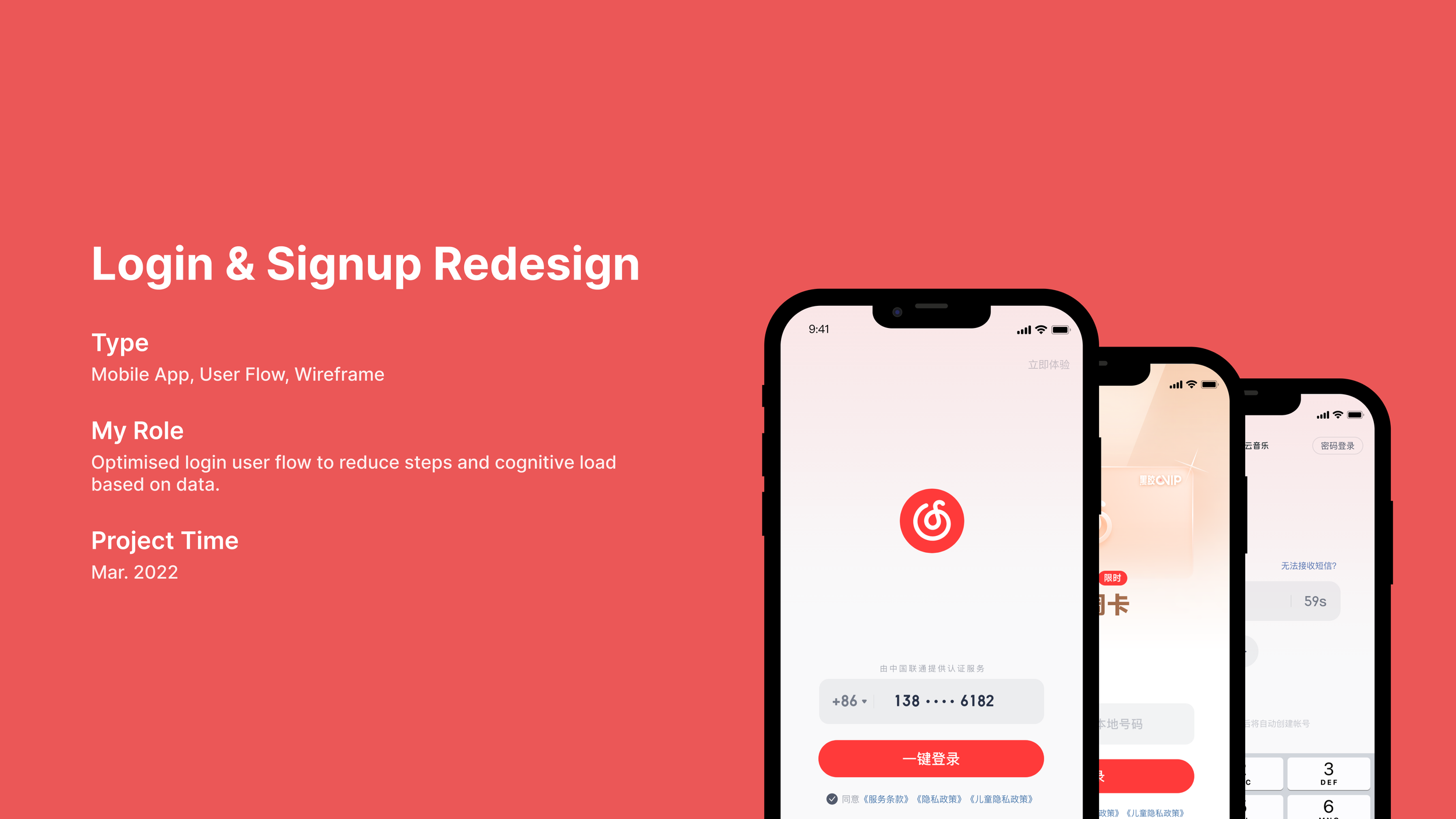
PROJECT BACKGROUND
Cloud Music, like many apps in China, leverages one-click login through network providers for a seamless user experience, an alternative to SMS verification. However, due to network instability, the process frequently exceeded the 3-second timeout, forcing users into a more costly SMS flow. As the UX designer, I led a project to increase one-click login adoption, improve user experience, and reduce operational costs.
Problem Analysis


I began by analyzing the existing user flow and synthesizing feedback from user reviews to identify core pain points.
Anxiety & Uncertainty: Users were left staring at a spinning animation on the splash screen with no clarity on what was happening or how long it would take.
Forced Navigation: If the number failed to load, the flow dead-ended. Users were forced to manually navigate to a different screen (SMS login), feeling punished for a system failure.
Inflexibility: To use a different number, users had to abandon the flow entirely and start over, creating friction and increasing the likelihood of bounce.
The analysis revealed that the core issue was treating number retrieval as a single, pass-or-fail event on a static screen. Our opportunity was to make the process continuous, transparent, and asynchronous.
I explored several concepts:
Concept A (Status Enhancement): Simply adding a better loader and a "skip" button. Verdict: Solved transparency but not flexibility.
Concept B (Parallel Paths): Showing both one-click and SMS options simultaneously. Verdict: Provided choices but created information complexity and didn't leverage the loading process.
Final Concept (Dynamic Field): Transforming the static number display into a smart, interactive input field that serves as the hub for the entire login process.
The Solution


The new design introduces two key changes that work in concert:
1. A Redesigned, Smart Input Field
The input field becomes the central, persistent element.
It provides live status updates (Retrieving number/Retrieved/Failed).
At any point, users can tap into the field to manually enter their number without changing screens. This solved the inflexibility problem immediately.
2. Continuous Background Retrieval & Smart Prompt
The system continues attempting to fetch the number in the background, even if the user starts typing.
If successful, a non-obtrusive bubble prompt appears, offering the one-click option. The user can accept this faster path or continue manually.
This turned a one-time failure into a continuous opportunity for success, maximizing one-click adoption.
Results
After launch, we monitored the key performance indicators:
Enhanced User Experience: The login process felt more responsive and user-controlled. Negative feedback about login delays dropped significantly.
Increased Registration Rate: The smoother flow contributed to a +0.28% increase in registration completion, a substantial gain for our user base.
Significant Cost Reduction: By drastically increasing the one-click login success rate, we reduced monthly SMS costs by approximately ¥ 43,000 RMB.
Reflection & Learning
This project underscored the power of designing for resilience and user control. Instead of designing for the ideal ("network is perfect"), we designed for the real world. By making a technical process transparent and giving users agency, we improved their experience and achieved strong business results. A small, thoughtful change to a single component created a win-win for both users and the company.