Background
As mobile devices became ambient fixtures in daily life, user expectations for music apps evolved. NetEase Cloud Music on PC and TV was praised for its immersive "companionship" in home/office settings. However, the mobile experience was confined by its vertical orientation, functioning primarily as a utility.
The Core Problem: The mobile app could not deliver the same ambient, companionable experience that users loved on larger screens. Concurrently, iOS 17's Standby mode highlighted the potential of horizontal screen companionship, and user demand for a landscape mode surged. The challenge was to break the constraints of the vertical screen without disrupting established user behavior.

Design Process: Double Diamond Model
The design process for landscape mode followed the classic Double Diamond: two “diverge–converge” cycles. We first diverged from the problem to map core functions, then diverged again to explore innovative ideas before converging on the final, shipped solution.

The diagram below outlines our entire design process following the application of the Double Diamond model. According to the implementation steps of the solution, it can be divided into three parts: "Preliminary Preparation" – "Building Foundational Capabilities" – "Crafting Highlights." Next, I will walkthrough the design process of the landscape mode based on these three parts.

Phase 1: Preliminary Preparation
I began with a comprehensive discovery phase to align the team and ground our decisions in user needs and market context. It includes three tracks: real-world scenarios, external benchmarks, and our own product realities.

Scenarios Analysis: I identified that landscape mode was primarily used in static, ambient contexts like desks or home shelves. We mapped the activities they usually do while listening to music in those contexts, then pinpointed pain points and innovation opportunities.

Competitive Analysis: I systematically analyzed competitors' landscape modes, mapping their feature sets, interaction patterns, and strategic positioning. This allows me to utilize their experience to tailor our own differentiated innovation.

Information Gathering: To keep the new mode consistent with the rest of the app, I cataloged existing data sets, features, and layout patterns. This was crucial for understanding constraints and opportunities for integration from the outset.

phase 2: Building Foundational Capabilities
Building on the user scenarios and dataset we compiled earlier, I followed a three-step process: Feature Sorting → Layout Design → Feature Adaptation to lock in the core capabilities of landscape mode during the design phase.

Feature Sorting: Using a Value-Cost Matrix, I facilitated a workshop with stakeholders to prioritize features. This data-driven approach allowed us to build consensus on a Minimum Viable Product (MVP) while planning for future iterations. We categorized features into "Must-Have" (e.g., cover art, playback controls) and "Future Innovations."

Based on the matrix diagram, we identified the essential features for the landscape mode, such as the album cover and playback controls. I also made trade-offs among the desirable features based on scenarios and screen space to finalize the feature scope of the landscape mode.
Once the features were determined, the next step was to construct the overall page layout, gradually transitioning from the "functional scope layer" to the "information structure layer." To maintain consistency with users' existing logic and behavior patterns, we heavily referenced the layout of NetEase Cloud Music's player pages on PC and TV, striving for consistency in both the framework structure and interactive operations. This design approach not only helps users maintain a coherent experience when switching between different devices but also provides a mature and feasible layout reference for the landscape mode. From this, I derived a left-right split structure scheme that is more suitable for mobile landscape orientation.

Finally, I had to make the landscape mode fit different content type and skins. The base layout works for most existing features and player skins, optimized for glanceability and familiarity, but it can’t handle the more immersive ones. Since screens like Sleep Mode, Aura Mode and Hot-comment Player are functionally and contextually perfect for landscape, I created a second, immersive landscape layout dedicated to them.

I ultimately landed on two landscape frameworks: a side-by-side layout and a full-screen immersive layout. The immersive version gives more room for immersive design, delivering a deeper, more atmospheric experience.

With the core capabilities and frameworks now in place, the foundation of landscape mode is complete. Building on this base, I moved into the second “diverge” wave—brainstorming innovative highlights that will make the landscape experience shine.
Phase 3: Crafting Highlights
With a robust foundation in place, I focused on creating signature interactions that would delight users and define the experience.

I brainstormed and sketched multiple concepts for core interactions, with a focus on the playlist. The goal was to move beyond a simple list to a visualization that leveraged the horizontal canvas.

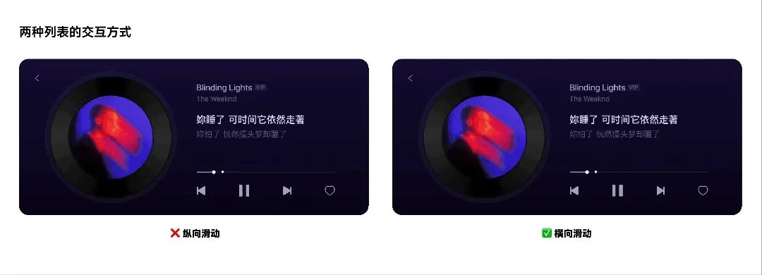
I eventually narrowed it down to two list-interaction concepts—horizontal swipe and vertical swipe. After testing the demos, the horizontal scrolling model emerged as the superior solution. It offered a more natural thumb path and a more stable scrolling feel.
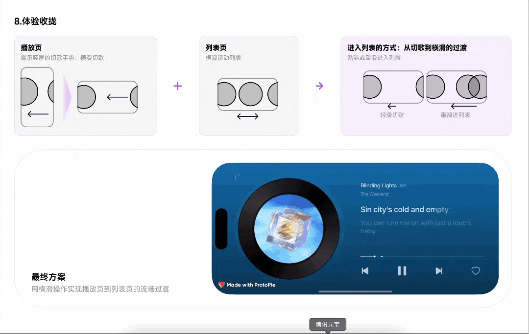
I believe the magic is in the details. To perfect the experience, I crafted the micro-interactions. A normal swipe skips tracks, while swipe-and-hold or a firmer swipe will get you to the immersive playlist—an easy, no-break way to pick your songs.
To polish the feel I worked hand-in-hand with engineering on motion curves and haptics.
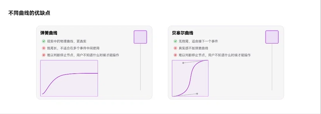
Spring curves are the usual choice for “real-world” tactility, but in production they proved sub-optimal: their long tails block new input until the animation settles, making the interaction feel sluggish. We needed an animation that could finish swiftly and let the user be able to keep swiping. In the end, a well-tuned Bézier curve gave the smoothest, most responsive ride.
To provide a realistic tactility, I specified distinct haptic engine vibrations for key moments, like when the vinyl sprite "clicks" into place, mimicking physical interactions to enhance the sense of direct manipulation.

Summary & Results
Designing landscape mode was more than a UI restructure—it was an exploration of how “companionship” and full immersion can extend into new contexts. Starting from real user behavior, we pinpointed when and why landscape adds value on mobile; through competitive analysis and an internal capability map, we built the core feature set and layout framework; finally, by re-imagining the playlist, lyric motion, and micro-interactions, we delivered a differentiated experience.
The launch of the landscape mode was a resounding success, quantitatively validating our design approach and qualitative goal of creating a "companion."
Tangible Outcomes:
Massive Adoption: Following the launch, the Landscape Mode's Daily Active Users (DAU) reaches 800,000 to over 1 million, demonstrating its immediate value to a vast user segment.
Deep Engagement: The average time spent per user in landscape mode reached approximately 200 minutes per day. This staggering figure confirmed that we had successfully transitioned the mobile app from a sporadic utility to an immersive companion.